How to Read a Quartz Slab: Veining, Background, Movement, and Finish
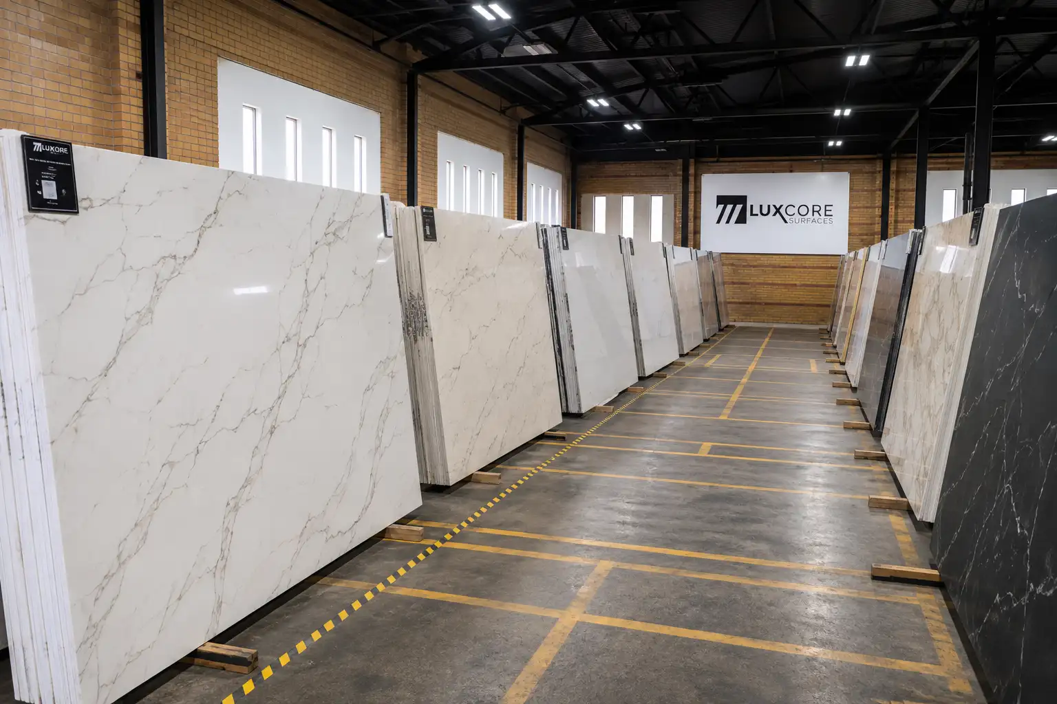
Choosing a quartz countertop is easier when you know what you are actually looking at. At first, many slabs can blur together, especially when you are comparing several white, gray, cream, or marble-look quartz patterns side by side.
You may know you want quartz. You may even know you like soft gold veining, a bright white background, or something with a little more movement. But when you are looking at a full slab, a showroom display, or a product photo online, it can still be hard to explain why one option feels right and another one does not.
That is where learning how to “read” a quartz slab helps. Instead of judging the slab only by whether it looks pretty in a photo, you can break it down into four visual details: background, veining, movement, and finish.
Once you understand those four things, you can compare quartz patterns more confidently and walk into a showroom with better questions. You do not have to become a designer or stone expert. You just need enough visual language to understand what you like, what might work in your space, and what you should see in person before making a final decision.
Quick Answer: How to Read a Quartz Slab
To read a quartz slab, start with the background color, then study the veining, movement, and finish. The background affects how bright, warm, cool, soft, or dramatic the countertop will feel, while the veining and movement determine how much visual energy the slab brings to the room.
The finish also changes how the slab looks under light. A polished finish can make the pattern feel brighter and more reflective, while a softer finish can make the surface feel more muted, natural, or understated. The best way to evaluate quartz is to view a full slab in person, compare it with your cabinet and flooring colors, and imagine how the pattern will look across a full countertop or island.
Why Quartz Slabs Can Look Different in Person Than Online
Online photos are helpful, but they do not tell the whole story. A slab image can show the general color and pattern, but it may not show the true scale of the veining, the undertone of the background, or how the surface reacts to real lighting.
This is one reason homeowners sometimes fall in love with a quartz pattern online and feel surprised when they see it in person. The slab may be warmer than expected, more dramatic than the small photo suggested, or softer once it is viewed under showroom lighting instead of screen brightness.
Small samples can also be useful, but they have limits. A small piece might show the background color and part of the vein, but it may not show the full rhythm of the slab or how the pattern travels across a large kitchen island.
That does not mean online research is bad. It simply means online research should help you narrow your direction, while the full slab helps you make the real decision.
Start With the Background Color
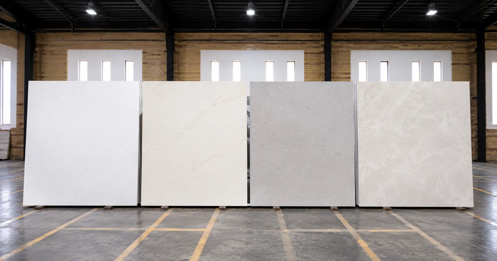
The background is the base color of the quartz slab. It is what your eye sees behind the veining, and it has a major effect on how the countertop feels in the room. Some backgrounds are bright white and crisp. Others are creamy, warm, gray, taupe, soft beige, or cloudy. Even two slabs that both look “white with veining” online can feel very different once you compare the background tones in person.
A bright white background usually creates a cleaner, sharper look. It can work well in modern kitchens, high-contrast designs, and spaces where you want the countertop to feel fresh and open.
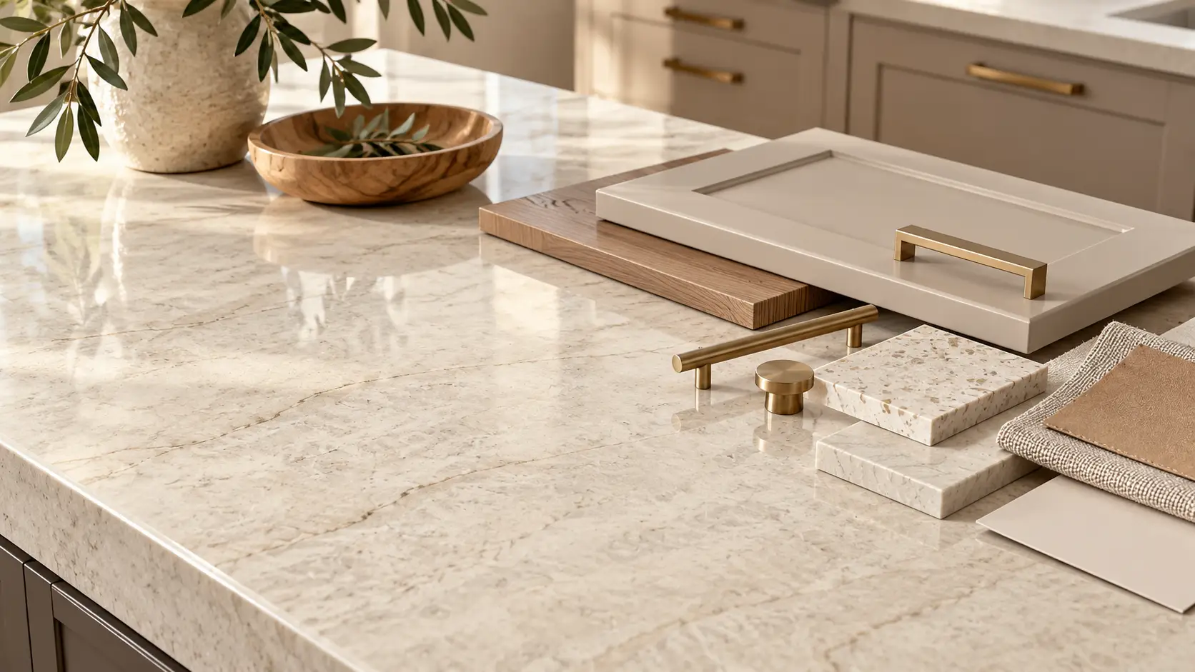
A warmer background often feels softer and more natural. It can pair beautifully with wood cabinets, cream cabinetry, warm flooring, brass hardware, or spaces where stark white might feel too cold.
A gray or cloudy background can create a more blended look. It may feel calmer than a high-contrast white slab, especially if the cabinets, backsplash, or flooring already have strong visual details.
When you look at a quartz slab, ask yourself what the background is doing before you focus on the veins. Is it brightening the room, softening the room, warming the room, cooling the room, or adding contrast?
Pay Attention to Undertones
Undertones are the subtle color shifts inside the background and veining. They are easy to miss at first, but they can make a big difference once the countertop is installed. A quartz slab may look white at first glance but still have warm cream undertones. Another slab may look white but lean cooler, with gray or blue undertones. A third may feel neutral in the showroom but pick up warmth next to wood cabinets.
This matters because countertops do not exist by themselves. They sit next to cabinets, flooring, backsplash tile, wall paint, appliances, hardware, and lighting. A slab that looks perfect on its own can feel slightly off if the undertone fights with the rest of the room.
Before choosing a quartz slab, compare it against the colors already going into your space. Cabinet doors, flooring samples, tile samples, paint swatches, and hardware finishes can all help you see whether the slab belongs with the rest of the design.
Then Look at the Veining
Veining is one of the biggest reasons homeowners are drawn to quartz, especially marble-look quartz. Veins can be thin, bold, branching, linear, soft, smoky, dramatic, warm, cool, gray, gold, taupe, or high contrast.
Thin veining usually feels more subtle and quiet. It can be a good fit if you want the countertop to add detail without becoming the main focal point of the room.
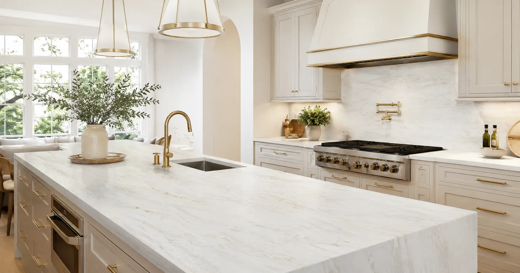
Bold veining creates more drama. It can look beautiful on a large island, a waterfall edge, or a kitchen where the countertop is meant to be the statement piece.
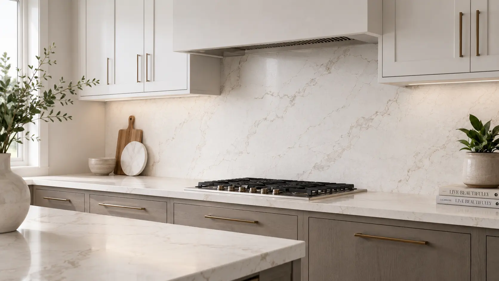
Gold or warm veining can bring warmth into a space. It often pairs well with brass hardware, warm wood tones, creamy cabinets, and softer transitional designs.
Gray veining can feel cooler and more classic. It often works well with white cabinets, gray cabinetry, black accents, stainless appliances, and modern or traditional spaces.
When comparing veining, do not only ask whether you like the color. Ask how strong the veins are, how often they appear, how much contrast they create, and whether they feel calm or energetic across the full slab.
Understand Movement

Movement is the way your eye travels across the slab. It is not just about the individual veins; it is about the overall flow, spacing, direction, and rhythm of the pattern.
Some quartz slabs have soft movement. Your eye moves gently across the surface, and no single area dominates the slab. This can be helpful in kitchens where you already have visual texture from tile, cabinets, flooring, or open shelving.
Other slabs have strong movement. The veins may sweep across the slab, branch dramatically, or create bold focal areas. This can be stunning, but it is important to imagine that movement across the actual size of your countertop.
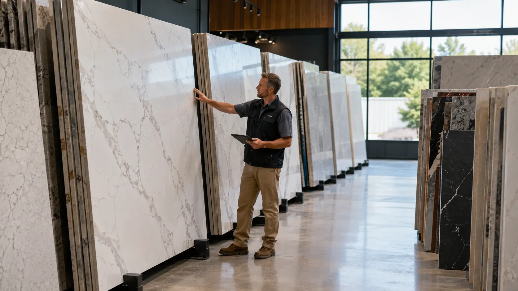
A slab that looks beautiful standing vertically in a showroom may feel much busier once it is laid horizontally across a large island. That does not make it the wrong choice, but it does mean you should picture the pattern at countertop scale before deciding.
For large islands, movement matters even more. A dramatic slab can make the island feel custom and high-end, while a calmer slab can make the kitchen feel more open and relaxed.
Think About Scale
Scale is the size of the pattern compared with the size of the surface. A large, sweeping vein may look elegant on a full slab but may not show up the same way on a small bathroom vanity. The opposite can also happen. A smaller, busier pattern may look balanced on a bathroom vanity but feel too active when repeated across a large kitchen with a long perimeter and island.
This is why it helps to know where the slab will be used. A powder bath, primary bathroom, kitchen perimeter, full-height backsplash, waterfall island, and large open kitchen all show the pattern differently.
When you are in the showroom, ask how the slab might read once it is cut for your project. You are not just choosing a slab image. You are choosing how that image will appear across the actual surfaces in your home.
Do Not Judge the Slab From One Small Area
One common mistake is falling in love with one corner or one vein of a slab without looking at the whole surface. Quartz patterns can vary across the slab, especially when the design includes dramatic movement or large veining. Step back and look at the slab from a distance. Then move closer and look at the details. Both views matter because you will experience your countertop from across the room and up close every day.
The faraway view tells you how the slab feels in the overall room. The close-up view tells you whether you like the details, depth, color variation, and texture of the pattern. A good showroom visit gives you time to do both. You should not feel rushed into judging a slab from a phone photo, a small sample, or one close-up section.
Look at the Finish
The finish is the surface treatment of the quartz. It affects shine, reflection, texture, and the way the color reads under light.
A polished finish is smooth and reflective. It often makes colors look brighter and can make veining feel sharper or more defined.
A matte, honed, or softer finish can make the slab feel more understated. It may reduce glare and create a quieter, more natural look, depending on the product and lighting.
Finish matters because your kitchen or bathroom lighting will interact with the surface. A bright polished slab under strong recessed lights may feel very different from the same pattern under soft natural light.
When comparing finishes, do not only think about appearance. Think about how the surface will feel in the room during the day, at night, under pendant lights, and next to nearby finishes like tile, cabinetry, and hardware.
Consider Your Lighting
Lighting can change how quartz looks more than many homeowners expect. Natural daylight, warm bulbs, cool bulbs, under-cabinet lighting, and showroom lighting can all shift the way a slab reads. A white quartz with warm veining may look creamy in evening light. A cooler white quartz may look crisp during the day but slightly gray in a room with limited natural light.
This is why bringing samples to the showroom is helpful. Cabinet doors, backsplash tile, flooring, and paint colors give the showroom team context for how the slab might behave in your actual space. Photos of your kitchen or bathroom can help too. Even simple phone photos can show the amount of natural light, cabinet style, flooring tone, and overall design direction.
Compare Similar Quartz Patterns Side by Side
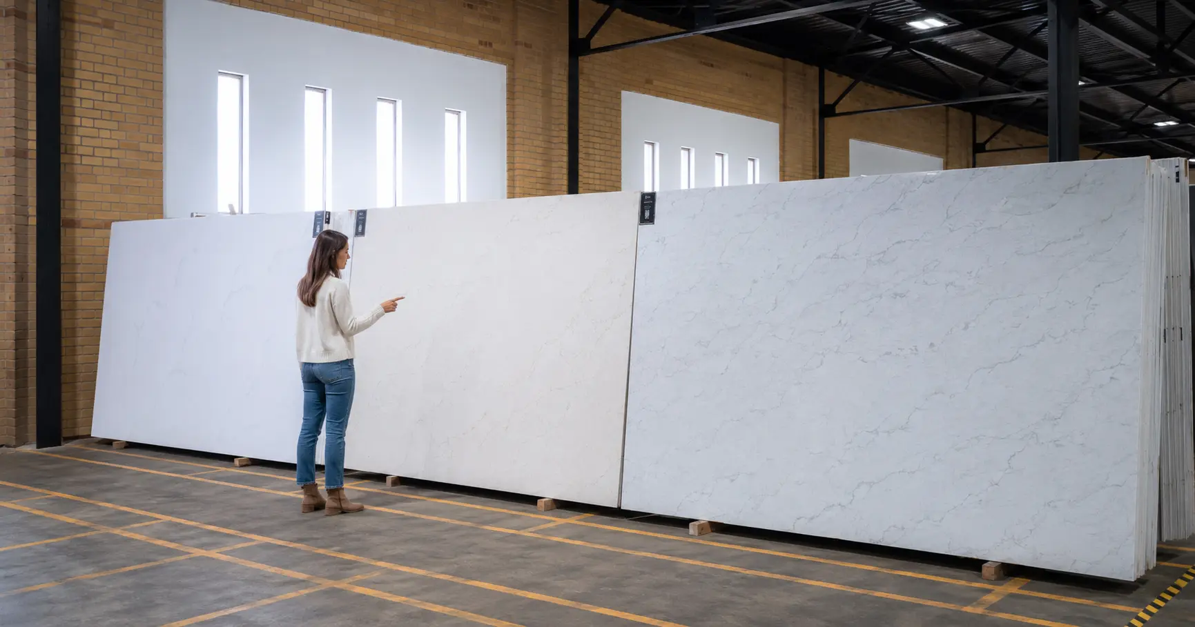
If you are choosing between several similar quartz slabs, do not compare them from memory. Put them side by side whenever possible and look for the differences in background, veining, movement, and finish.
For example, two Calacatta-style quartz patterns may both have white backgrounds and warm veining. One may have a cleaner background and bolder veins, while another may have softer movement and a warmer overall tone.
Those differences may seem small online, but they can become obvious in person. Once you see them together, you may realize one feels too dramatic, one feels too cool, or one fits your cabinet color better. This is where an educated showroom experience can make the decision easier. A helpful team can point out visual differences you may feel but not yet know how to name.
Think About the Whole Room, Not Just the Slab
A quartz slab can be beautiful and still not be the right slab for your room. The goal is not to choose the most dramatic or most popular pattern; the goal is to choose the pattern that works with the full design.
If your cabinets are simple and your backsplash is quiet, a slab with stronger veining may become the focal point in a good way. If your cabinets, flooring, and tile already have a lot of texture or pattern, a calmer quartz may help the room feel balanced.
Hardware also matters. Warm gold or brass finishes often pair well with warm veining, while black, chrome, or stainless accents may work better with cooler or more neutral tones. The best quartz choice usually feels connected to the room. It should not look like a beautiful slab that was chosen separately from everything else.
Remember That Countertops Are Horizontal
Most slabs are displayed vertically, but countertops are installed horizontally. That shift changes how you experience the pattern. A vein that looks like it flows upward on a vertical rack may stretch across your island once installed. A bold section that looks dramatic on the wall may become the center of attention when it sits flat under pendant lights.
This does not mean you should avoid movement. It simply means you should imagine the slab in the orientation and scale of your actual project. For waterfall edges or full-height backsplash applications, direction matters even more. The way the veining travels can affect how seamless, dramatic, or custom the finished installation feels.
Common Mistakes When Reading a Quartz Slab
One common mistake is choosing only from a small sample. Samples are helpful for color and feel, but they rarely show the full movement or scale of the slab.
Another mistake is ignoring undertones. A slab that looks white online may lean warm, cool, creamy, gray, or beige in person, and those subtle shifts can affect how it works with your cabinets and flooring.
A third mistake is choosing the most dramatic slab without considering the size of the space. Bold veining can be stunning, but it should be chosen intentionally so it feels like a feature rather than visual clutter.
A fourth mistake is not asking what happens next. Once you like a quartz pattern, you still need to understand how to see it in person, confirm availability, coordinate with your fabricator, and move toward installation.
Questions to Ask in the Showroom
When you visit a quartz showroom, you do not need to have the perfect design vocabulary. You just need to ask questions that help you understand what you are seeing.
Ask whether the background reads warm, cool, bright, creamy, gray, or neutral. This helps you avoid choosing a slab that clashes with your cabinets, tile, or flooring.
Ask how bold the veining will feel across a full island or kitchen perimeter. This helps you think beyond the slab photo and imagine the finished countertop.
Ask whether similar patterns are available to compare side by side. If you like one quartz option but feel unsure, seeing nearby alternatives can make the decision much clearer.
Ask how the finish affects the look of the slab under light. Shine, reflection, and softness can all change the way the pattern feels in your space.
What to Bring When You Look at Quartz Slabs
You do not need every design decision finalized before visiting a showroom. A few simple items can make the visit much more useful.
Bring photos of your kitchen or bathroom, even if the space is unfinished. These photos help the showroom team understand lighting, cabinet style, flooring tone, and the overall feel of the room.
Bring cabinet samples, cabinet colors, flooring samples, backsplash tile, paint swatches, or hardware finishes if you have them. These details make it easier to see whether a slab belongs with the rest of the space.
Bring inspiration photos, too. Even if the exact slab is different, inspiration photos help explain the mood you are trying to create.
What Happens After You Find a Quartz Pattern You Like
After you find a quartz pattern you like, the next step is usually to see the slab in person and confirm how it works with your project. From there, the showroom team can help you understand availability and how the slab selection connects with your fabricator or installer.
Many homeowners are surprised to learn that the supplier, fabricator, and installer may each play a different role. The supplier helps you view and select the slab, while the fabricator typically handles measuring, cutting, edging, and installation coordination.
You do not need to understand every part of the process before you visit. A good showroom can help you understand what step you are on and what information your fabricator may need next.
For Rachel-stage shoppers, the goal is not to rush into a quote before you are ready. The goal is to move from “I like this pattern online” to “I understand how this slab looks in person, and I know what to do next.”
How LuxCore Helps Homeowners Compare Quartz Slabs
At LuxCore Surfaces in Ogden, the showroom experience is built around helping homeowners see the difference between quartz patterns in person. Instead of relying only on small samples or online photos, you can compare slabs side by side and talk through background color, veining, movement, finish, and how each option may read in your space.
This is especially helpful when you are comparing similar quartz looks, such as white marble-look slabs, soft warm patterns, bold Calacatta-style veining, or more subtle designs. Seeing the slabs together can make the difference much easier to understand.
You can bring inspiration photos, cabinet colors, flooring samples, backsplash ideas, or even simple phone photos of your project. The goal is not to pressure you into a decision before you are ready, but to help you understand what you are looking at so your next step feels clearer.
FAQs About Reading a Quartz Slab
What should I look at first when choosing a quartz slab?
Start with the background color before looking at the veining. The background has a major effect on whether the countertop feels bright, warm, cool, soft, clean, creamy, or dramatic in your room. After that, look at the veining, movement, and finish. Those details determine how much visual interest the slab adds and how it will feel across a full countertop or island.
Why does quartz look different online than it does in person?
Quartz can look different online because screens, lighting, photography, and image size all affect how the slab appears. A product photo may show the general pattern, but it may not show the full scale, undertone, depth, or finish accurately. Seeing the slab in person gives you a better sense of color, movement, and reflection. It also lets you compare the slab with your cabinet, flooring, tile, or paint samples.
Is a small quartz sample enough to choose from?
A small sample can help you understand the background color, finish, and part of the pattern. It is useful, but it does not always show the full movement or scale of the slab. For subtle quartz patterns, a sample may be enough to narrow your choices. For slabs with strong veining or dramatic movement, it is better to see the full slab before making a final decision.
What does movement mean in a quartz slab?
Movement is the way the pattern flows across the slab. It includes the direction, spacing, size, and rhythm of the veining or color variation. Soft movement feels calm and blended, while strong movement feels more dramatic and eye-catching. The right choice depends on whether you want the countertop to quietly support the room or become a major design feature.
How do I know if quartz veining is too busy?
Quartz veining may feel too busy if it competes with your cabinets, backsplash, flooring, or other design elements. A dramatic slab can look beautiful, but it should have room to be the focal point. If your room already has strong texture or pattern, a calmer quartz may create better balance. If the rest of the space is simple, bolder veining may work well.
Does quartz finish affect the color?
Yes, the finish can affect how the color and pattern appear. A polished finish often makes the slab feel brighter and more reflective, while a softer finish can make the pattern feel more muted or natural. Lighting also plays a role. The same quartz slab can look different under natural daylight, warm bulbs, cool bulbs, showroom lights, and pendant lighting.
Should I choose the slab before my backsplash?
In many projects, it helps to choose the countertop before finalizing the backsplash. The countertop usually covers more visual space and can set the direction for the rest of the room. Once the quartz is selected, you can choose a backsplash that supports it instead of competing with it. This is especially important if the slab has bold veining or strong movement.
What should I bring to a quartz showroom?
Bring photos of your kitchen or bathroom, cabinet samples or cabinet colors, flooring samples, backsplash tile, paint swatches, hardware finishes, and inspiration photos if you have them. You do not need all of these items, but each one gives helpful context. Even simple phone photos can make the visit more productive. They help the showroom team understand your lighting, layout, and design direction.
Clear Next Steps
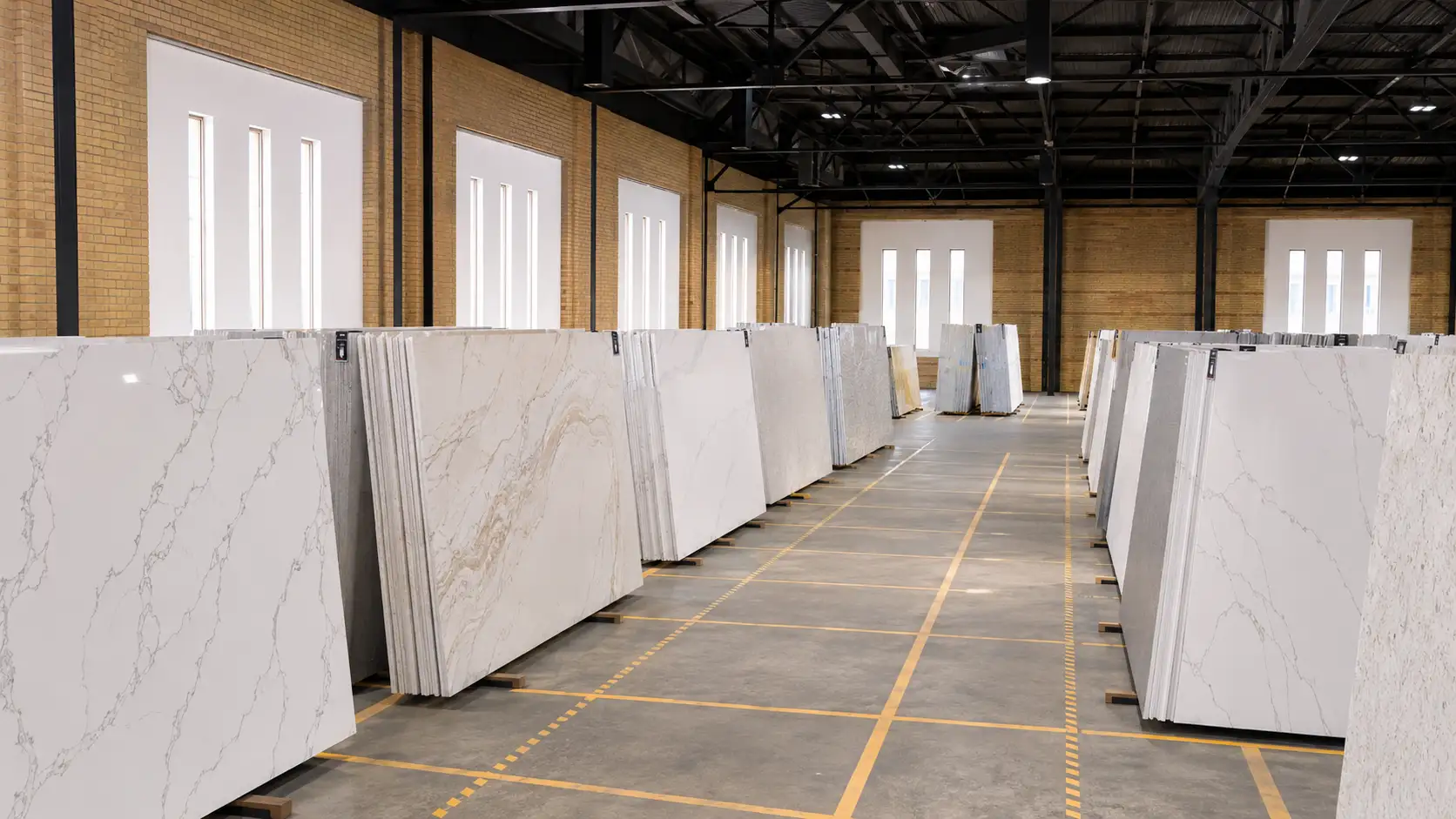
Before you choose a quartz slab, take time to look at the background, veining, movement, and finish. Those four details will tell you more than a generic description ever could.
If you are still comparing patterns online, save the ones you like and note what draws you to each one. Maybe it is the warm veining, the clean background, the soft movement, or the way the finish feels in a photo.
When you are ready to see the difference in person, visit LuxCore Surfaces in Ogden and bring your inspiration photos, cabinet colors, flooring samples, or backsplash ideas. The team can help you compare quartz slabs side by side and understand which pattern fits your space, your style, and your next step.