How to Pair Quartz Countertops With Cabinet Colors

Choosing quartz countertops is exciting until the cabinet color enters the conversation. A slab can look beautiful online, perfect in an inspiration photo, and completely different once you imagine it next to your actual cabinets. That does not mean you are overthinking it. Countertops and cabinets take up a lot of visual space, so even small differences in undertone, veining, lighting, and contrast can change the whole feel of the kitchen.
The good news is that your quartz and cabinet colors do not have to match perfectly. They just need to relate to each other in a way that feels intentional. When you understand undertones, contrast, movement, and lighting, it becomes much easier to narrow your options before you visit the showroom.
Quick Answer: How Do You Pair Quartz Countertops With Cabinet Colors?
The best way to pair quartz countertops with cabinet colors is to compare undertones first, then decide how much contrast and movement you want in the space. Warm cabinets usually pair best with quartz that has cream, beige, taupe, brown, or gold undertones, while cool cabinets often work better with quartz that has white, gray, blue-gray, or charcoal undertones.
After that, look at the veining. The veining does not have to match the cabinets exactly, but it should connect with something in the room, such as cabinet hardware, flooring, backsplash, wall color, or wood tones. Online photos can help you narrow your style, but the final decision should happen with your cabinet color and the full quartz slab side by side.
Start With Undertone, Not Just Color
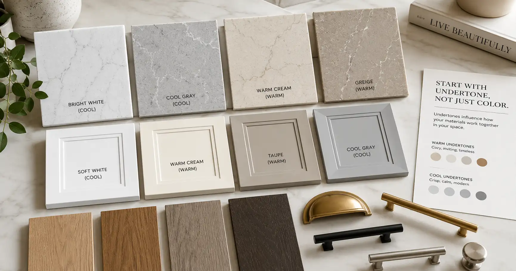
Most homeowners start by saying, “I want white quartz,” or “I have gray cabinets,” but color names are only the beginning. The undertone is what usually makes a pairing feel right or wrong.
White cabinets, for example, can be bright white, warm white, creamy white, off-white, or slightly gray. A bright white cabinet next to a creamy quartz can make the quartz look yellow. A warm white cabinet next to a cool gray-white quartz can make the cabinets look dingy or mismatched.
The same thing happens with gray, wood, green, navy, and black cabinets. Gray cabinets may lean blue, green, taupe, or charcoal. Wood cabinets may lean golden, red, orange, brown, or ashy. Once you know the undertone, you can choose quartz that either supports it softly or contrasts with it on purpose.
A helpful rule is this: if the cabinet color has a warm undertone, look for quartz with some warmth in the background or veining. If the cabinet color has a cool undertone, look for quartz with a cleaner white, soft gray, or cooler movement.
Pairing Quartz With White Cabinets
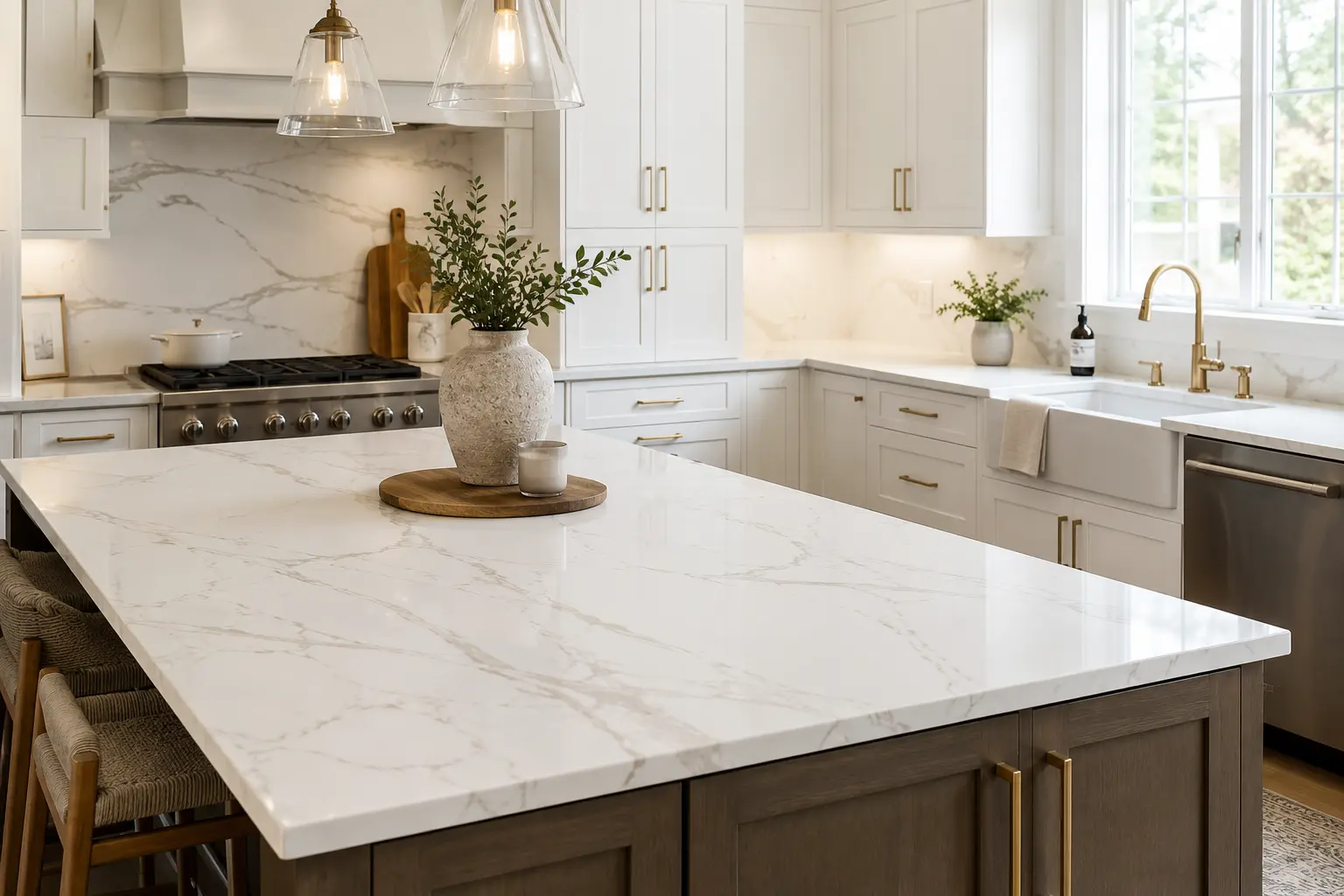
White cabinets are popular because they feel clean, bright, and flexible, but they are not as automatic as people think. White does not always “go with everything” when you are dealing with large surfaces.
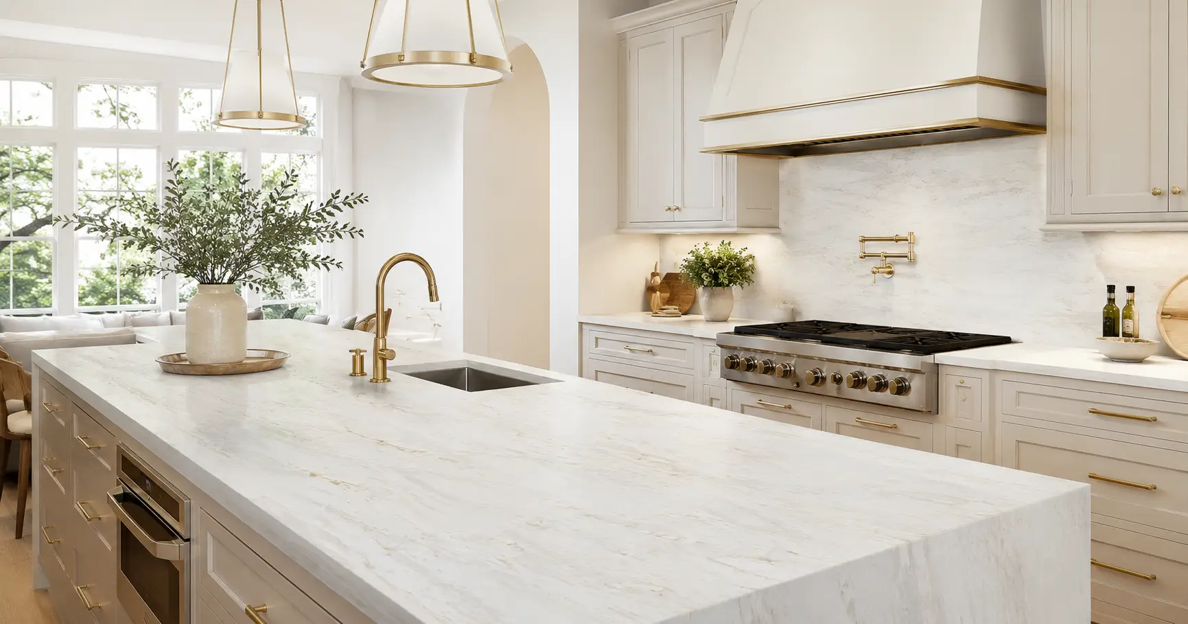
With white cabinets, quartz can go in several directions. A soft white quartz with subtle gray veining creates a clean and classic look. A white quartz with gold or warm beige veining adds warmth and works especially well with brass, champagne bronze, or warm wood accents. A bolder marble-look quartz can turn a simple white kitchen into something more dramatic and custom.
The main thing to watch is whether the whites fight each other. If your cabinets are warm white, a cold blue-white quartz may make the cabinets look yellow. If your cabinets are crisp white, a creamy quartz may look duller than expected. This is one of the biggest reasons to bring a cabinet sample or paint swatch when you compare slabs in person.
White cabinets can also handle more movement than many homeowners expect. Because the cabinets are visually quiet, a quartz pattern with stronger veining can become the focal point without making the kitchen feel too busy.
Pairing Quartz With Wood Cabinets
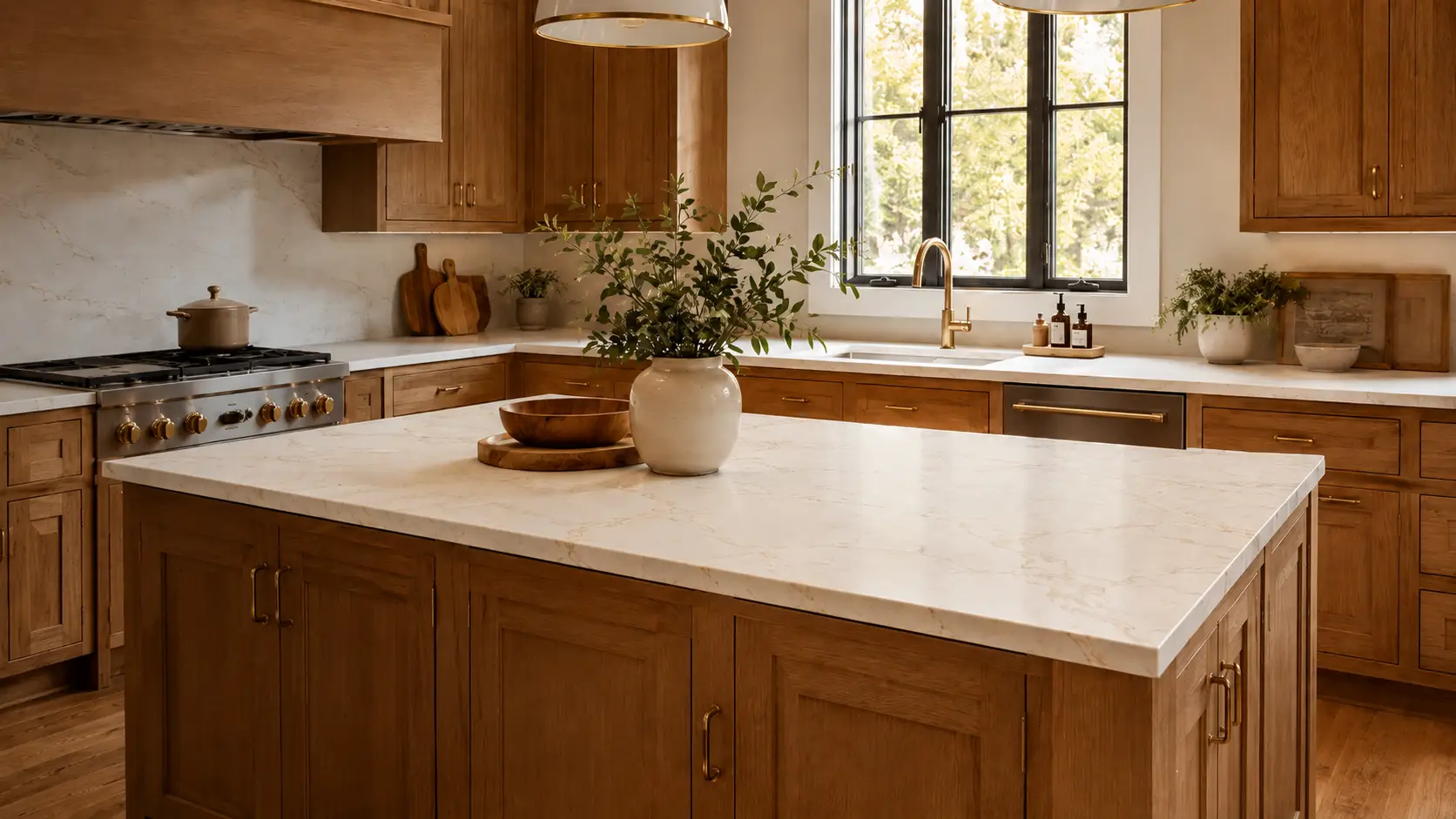
Wood cabinets bring natural warmth into a kitchen, so the quartz should either complement that warmth or balance it. This is where undertone matters a lot.
Golden oak, honey-toned wood, and warm maple cabinets usually pair well with quartz that has cream, beige, warm white, soft taupe, or gold movement. These tones help the kitchen feel connected instead of split between a warm cabinet and a cold countertop.
Walnut, darker brown stains, and rich wood cabinets can look beautiful with lighter quartz because the contrast keeps the space from feeling heavy. A soft white quartz with warm veining can brighten the room while still respecting the natural warmth of the wood.
Ashy, weathered, or cooler wood stains need a little more care. If the wood already leans gray or muted, a very warm quartz may feel disconnected. In that case, a soft white, greige, or subtle gray-veined quartz can create a calmer, more balanced look.
Pairing Quartz With Gray Cabinets

Gray cabinets can be tricky because gray is rarely just gray. Some gray cabinets lean blue. Some lean green. Some lean beige or taupe.
If your gray cabinets are cool, quartz with crisp white, soft gray, charcoal, or blue-gray movement can feel cohesive. If your gray cabinets are warmer or more greige, quartz with cream, taupe, beige, or soft gold veining may be a better fit.
The risk with gray-on-gray pairings is that the kitchen can start to feel flat. If the cabinets are gray and the quartz is also gray with very little contrast, the room may lack depth. You can solve that by choosing quartz with a lighter background, more visible veining, or a warmer accent that connects with hardware or flooring.
Gray cabinets also respond strongly to lighting. A gray cabinet that looks soft and neutral in daylight may look cooler under LED lighting. Before choosing a final quartz pattern, look at the cabinet color and slab under lighting that is similar to your kitchen.
Pairing Quartz With Navy, Green, Black, or Dark Cabinets
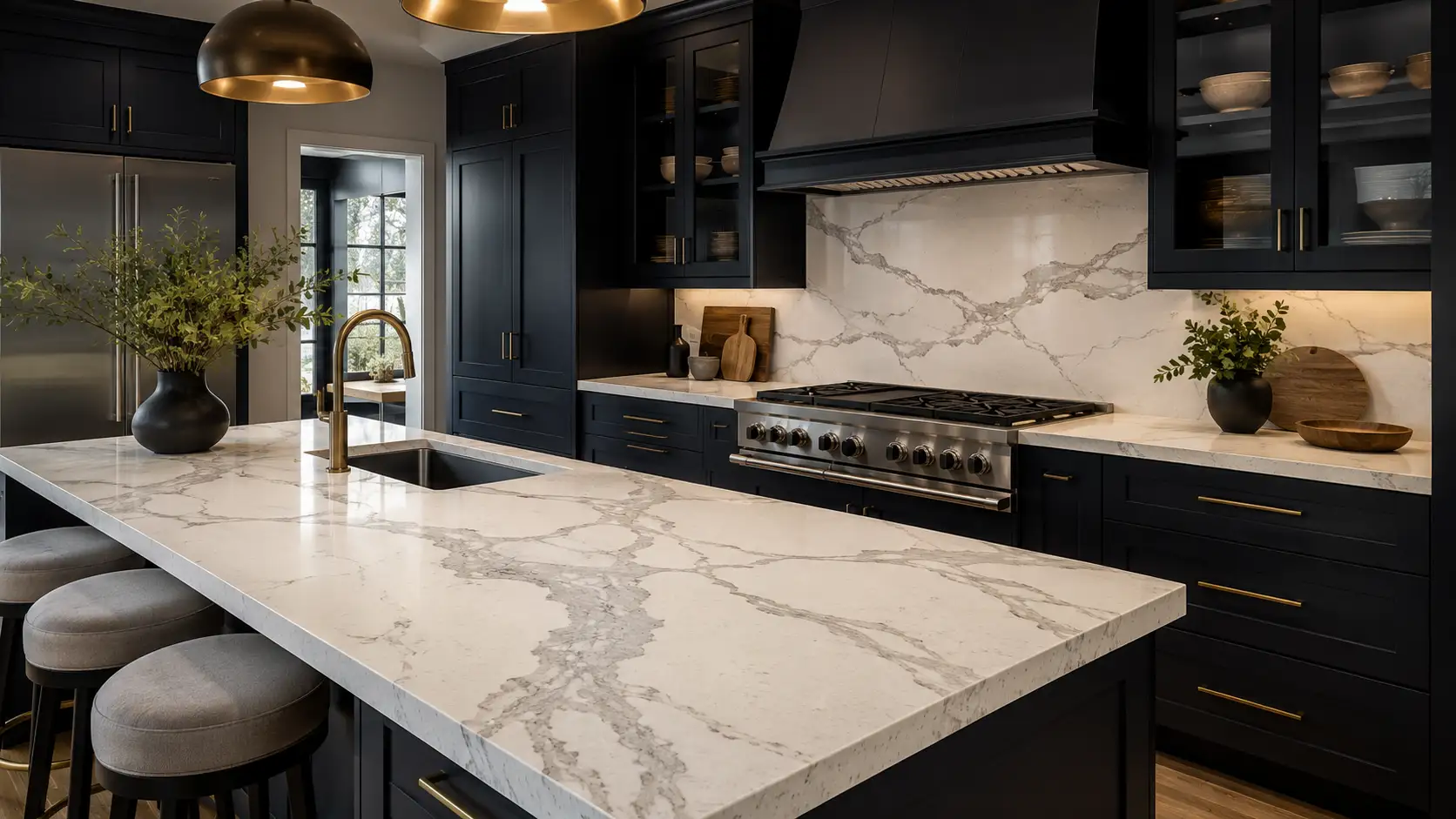
Dark cabinets can support more contrast and drama, which makes them a strong match for quartz with bold movement. Navy, forest green, charcoal, and black cabinets often look best when the countertop gives the eye somewhere to rest.
A white or warm white quartz can brighten dark cabinets and keep the kitchen from feeling too closed in. If the quartz has veining that connects to the cabinet color, the pairing can feel especially intentional. For example, soft gray veining can work with navy or charcoal cabinets, while warm gold or taupe movement can pair beautifully with green, black, or stained wood details.
With dark cabinets, it helps to think about the mood of the kitchen. If you want a refined and dramatic look, stronger veining can work well. If you want the cabinets to be the main statement, a quieter quartz may be better.
The only real caution is too many competing focal points. If the cabinets are bold, the backsplash is patterned, the flooring has movement, and the quartz is also dramatic, the space can start to feel visually crowded. One or two statement elements usually feel stronger than four.
Should the Quartz Match the Cabinets?
Your quartz does not need to match your cabinets exactly. In fact, trying to match too closely can make the design feel forced, especially if the colors are almost the same but not quite.
A better goal is connection. The quartz can connect to the cabinets through undertone, contrast, veining, or another finish in the room. A white quartz with gold veining may connect to warm wood cabinets or brass hardware. A gray-veined quartz may connect to cool cabinets, stainless appliances, or a soft gray backsplash.
Think of the countertop as part of the whole room, not a separate decision. Cabinets, countertops, flooring, backsplash, walls, hardware, and lighting all affect each other. The strongest pairings usually feel like the materials are having the same conversation, even if they are not the same color.
Should You Choose Cabinets or Countertops First?
If you are still early in the remodel, it often helps to choose the countertop and cabinet direction together. These two surfaces dominate the kitchen, so choosing one without considering the other can make the second decision harder.
If your cabinet color is already chosen, that is completely fine. Use it as the anchor. Bring the cabinet sample, door front, or paint color when you compare quartz, and look for slabs that either complement the cabinet undertone or create contrast on purpose.
If you have fallen in love with a specific quartz pattern first, you can work backward from the slab. Pull a cabinet color from the quartz background, veining, or overall mood. This works especially well with bold marble-look quartz because the slab may already contain warm, cool, light, and dark tones you can echo elsewhere in the kitchen.
The order matters less than comparing the actual materials together. A cabinet color chosen from a tiny paint chip and a quartz chosen from a website image can surprise you once they meet in real life.
Pay Attention to Veining, Not Just Background Color
The background color of the quartz matters, but the veining is often what ties the design together. Veining can be gray, charcoal, taupe, beige, brown, gold, cream, or a mix of several tones.
For a softer look, choose veining that is close to the cabinet color or other finishes in the room. For a bolder look, choose veining that contrasts with the cabinets but still connects to hardware, lighting, flooring, or backsplash.
The scale of the veining also matters. A subtle sample may look calm in your hand but much more noticeable across a full island. A dramatic slab may look busy online but feel balanced in person when you see the full movement and spacing.
That is why full slabs are so helpful. They show the real rhythm of the pattern, including how much movement appears across a large surface.
Think About the Whole Kitchen, Not Just the Cabinets
Cabinets and countertops are the main pairing, but they are not the only pairing. Your flooring, backsplash, hardware, wall color, appliances, and lighting all influence whether the quartz works.
For example, a white quartz with warm gold movement may look beautiful with warm wood floors and brass hardware. The same quartz may feel out of place in a kitchen with cool gray floors, chrome hardware, and blue-gray cabinets.
This does not mean everything has to match. It means at least a few elements should relate. If the veining has warmth, repeat warmth somewhere else. If the quartz has gray movement, make sure that gray connects to something in the space instead of appearing randomly.
A good countertop choice should make the kitchen feel more pulled together, not make every other material harder to choose.
Lighting Can Change Everything
Quartz and cabinet colors can shift depending on lighting. Natural light, warm bulbs, cool LED bulbs, under-cabinet lighting, and showroom lighting can all change how a surface reads.
A quartz that looks bright white under showroom lights may look softer or warmer at home. A cabinet color that looks neutral in daylight may look blue, green, or yellow in evening light. This is why it helps to view samples and slabs with your real home conditions in mind.
When you visit a showroom, tell the team about your kitchen lighting. Is the room bright and sunny? Does it face north and feel cooler? Are you using warm bulbs or cooler LEDs? These details can help narrow which quartz patterns are most likely to work in your space.
What to Bring When You Compare Quartz and Cabinets
You do not need to have every design decision finished before visiting the showroom. In fact, visiting before everything is finalized can make the process easier.
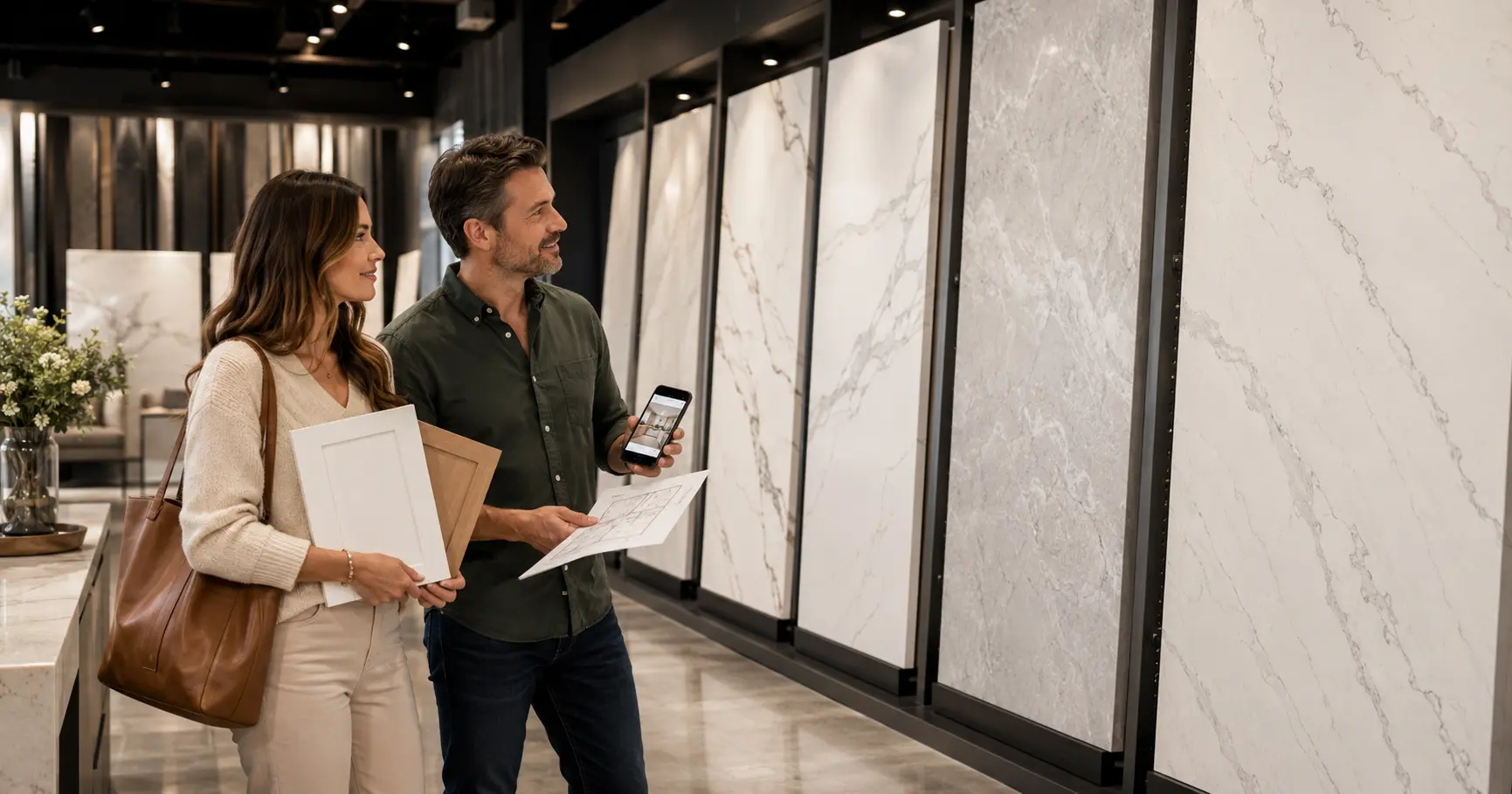
Bring anything that helps show the real direction of your kitchen. A cabinet sample, cabinet door, paint swatch, flooring sample, backsplash idea, hardware finish, and inspiration photos can all help. Even photos of your current kitchen can be useful because they show lighting, layout, flooring, and surrounding colors.
If you are comparing several similar quartz patterns, bring screenshots or product names. For example, if you are looking at white marble-look quartz, you may want to compare soft veining, warm gold movement, and more dramatic Calacatta-style patterns side by side. Seeing them next to your cabinet color can make the differences much clearer.
The goal is not to show up with the perfect answer. The goal is to bring enough context so someone can help you make a better decision.
Why Full Slabs Matter More Than Small Samples
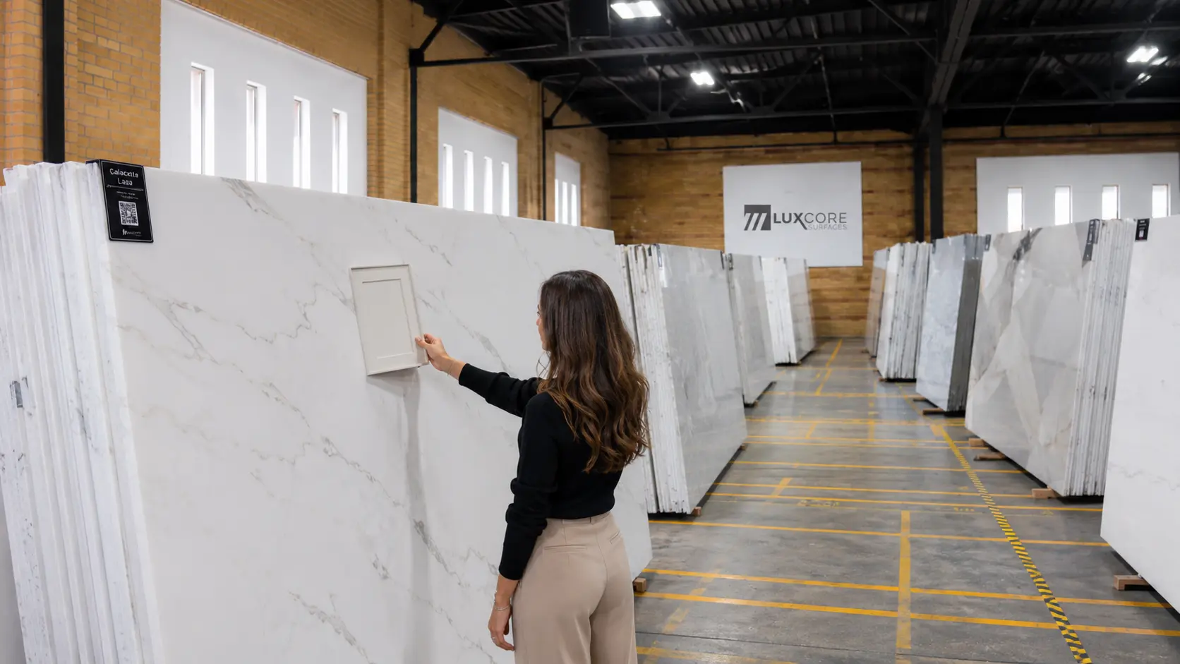
Small samples are helpful for checking general color and undertone, but they cannot show the full personality of a quartz pattern. They may only capture one quiet area or one dramatic vein.
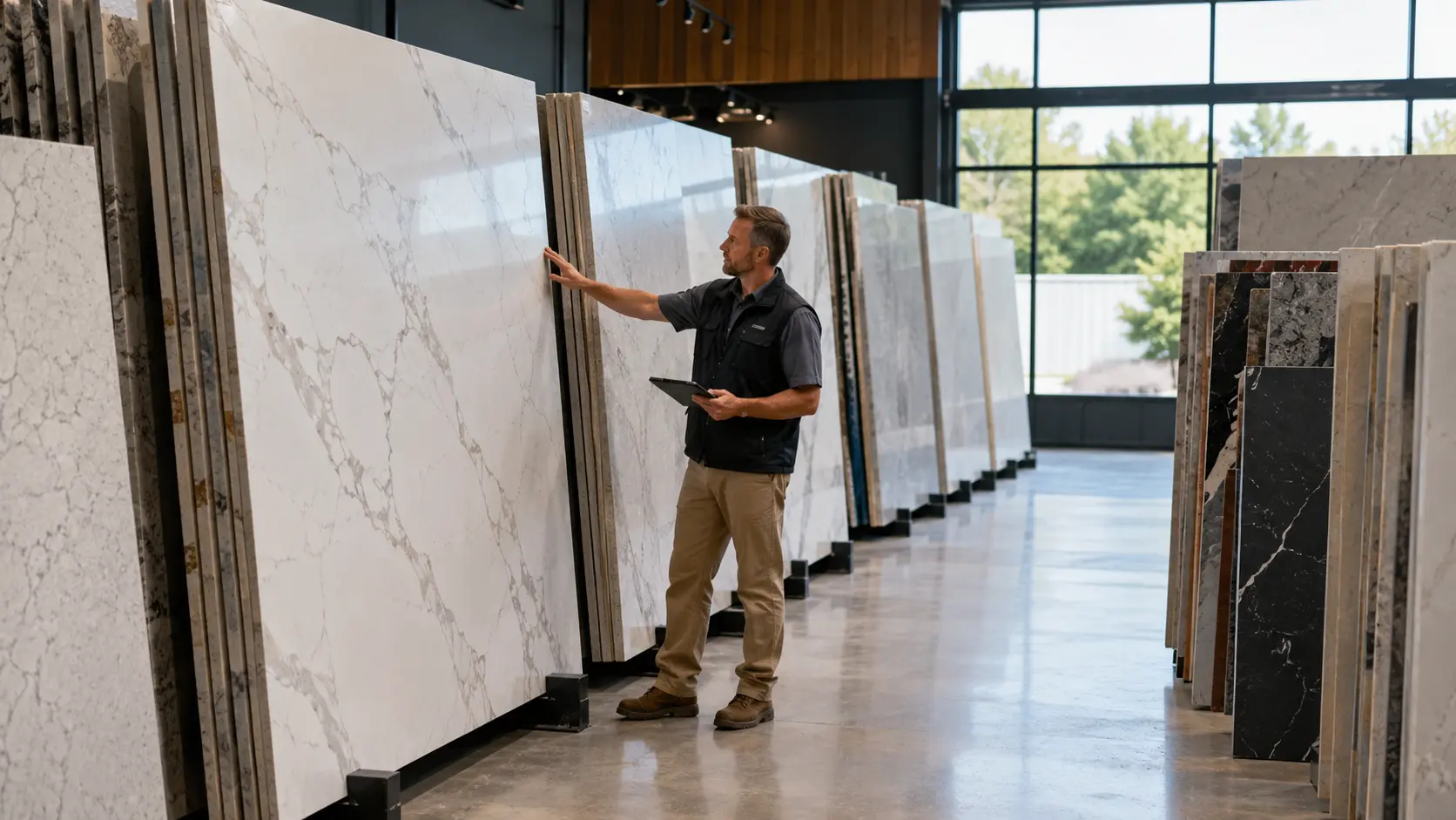
A full slab shows the actual scale, spacing, and movement of the pattern. This matters most for islands, long countertop runs, waterfalls, and kitchens where the countertop will be a major design feature.
This is also where online photos can be misleading. A website image may show the slab in perfect lighting, cropped in a certain way, or displayed without cabinets nearby. Seeing the full slab in person gives you a more realistic sense of how it may feel once installed.
For Researching Rachel, this is the bridge between inspiration and confidence. You can narrow your favorites online, but the final “yes” usually happens when the cabinet color and slab are side by side.
Simple Pairing Guide by Cabinet Color
For bright white cabinets, consider clean white quartz, soft gray veining, or bold marble-look movement if you want the countertop to become the focal point. Be careful with overly creamy quartz unless you want a warmer, softer kitchen.
For warm white, cream, or off-white cabinets, look for quartz with cream, beige, taupe, soft brown, or gold movement. These tones usually feel more natural than a very cool white slab.
For wood cabinets, choose quartz that respects the wood undertone. Warm woods often pair well with cream, warm white, beige, taupe, and gold-veined quartz, while cooler woods may work better with soft white, greige, or gray movement.
For gray cabinets, identify whether the gray is cool or warm before choosing quartz. Cool grays often pair with crisp white or gray-veined quartz, while warm grays and greiges often need softer, warmer undertones.
For navy, green, black, or charcoal cabinets, consider lighter quartz for contrast and balance. Dark cabinets can handle stronger veining, but the veining should still connect to hardware, flooring, or another finish in the kitchen.
When You Are Stuck Between Two Quartz Patterns
If you are torn between two quartz patterns, do not only ask which one is prettier. Ask which one works harder for the whole kitchen.
Look at the cabinet color first. Which slab makes the cabinet color look better? Then look at the flooring, backsplash, and hardware. Which slab connects more naturally with the other materials?
Also think about how much attention you want the countertop to receive. If the cabinets, backsplash, or flooring already have a lot of character, the quieter quartz may be the better choice. If the rest of the kitchen is simple, the more dramatic quartz may give the room the personality it needs.
This is the kind of decision that becomes easier in person. Side-by-side comparison helps you see differences that are hard to catch on a screen.
Clear Next Steps

If you are pairing quartz countertops with cabinet colors, start by collecting your real materials. Bring your cabinet sample, paint swatch, flooring sample, hardware finish, and inspiration photos together so you can see the design as a whole.
Then narrow your quartz direction online. Decide whether you want soft and subtle, warm and inviting, clean and modern, or bold and dramatic. Once you have a direction, visit the showroom and compare full slabs against your cabinet color in person.
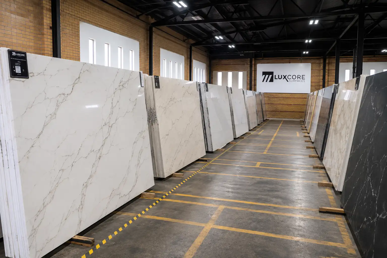
At LuxCore Surfaces in Ogden, homeowners can compare quartz slabs side by side and get practical design guidance before making a final selection. You do not need to have every detail figured out before you come in. Bring what you have, show the team what you like, and use the showroom visit to turn inspiration into a confident countertop decision.
FAQs About Pairing Quartz Countertops With Cabinet Colors
What color quartz goes best with white cabinets?
White cabinets work well with many quartz colors, including soft white, gray-veined white, warm white, and bold marble-look patterns. The best choice depends on whether your cabinets are bright white, warm white, cream, or off-white. For crisp white cabinets, cleaner white quartz or gray-veined quartz often works well. For warmer white cabinets, quartz with cream, beige, taupe, or gold movement may feel more natural.
Should countertops be lighter or darker than cabinets?
Countertops can be lighter, darker, or similar in value to the cabinets. What matters most is whether the pairing has enough contrast, balance, and undertone connection. Lighter countertops can brighten dark cabinets and make the room feel more open. Darker countertops can ground light cabinets and create a stronger statement. Similar tones can work too, but they need texture, veining, or contrast elsewhere so the room does not feel flat.
Should quartz veining match cabinet hardware?
Quartz veining does not have to match the hardware exactly, but it can help if they relate. Gold or warm beige veining often works well with brass, bronze, or warm wood accents, while gray or charcoal veining can connect with stainless, chrome, black, or cooler finishes. The goal is not a perfect match. The goal is for the veining to feel like it belongs with the rest of the kitchen.
Can you use bold quartz with dark cabinets?
Yes, bold quartz can look beautiful with dark cabinets, especially when the rest of the kitchen is balanced. Navy, green, black, and charcoal cabinets can support dramatic veining because the contrast feels intentional. The key is to avoid too many competing statement pieces. If the cabinets and quartz are both bold, consider keeping the backsplash, flooring, or wall color quieter.
Do I need to see the full slab before choosing quartz?
Yes, it is strongly recommended. Small samples and online photos are helpful for narrowing your style, but they do not show the full movement, scale, or veining of the slab. Seeing the full slab in person helps you understand how the pattern may look across an island, perimeter countertop, or long run of cabinets. It also lets you compare the quartz directly against your cabinet color before making the final decision.
What should I bring to the showroom when choosing quartz?
Bring your cabinet sample or cabinet door if you have one. If not, bring a paint swatch, flooring sample, backsplash idea, hardware finish, and inspiration photos. Photos of your kitchen are helpful too, especially if they show lighting, flooring, walls, and surrounding finishes. The more context you bring, the easier it is to compare quartz options in a way that reflects your real home.
Should I choose quartz before the backsplash?
In most kitchens, it is easier to choose the quartz before the backsplash. The countertop is usually a larger, more permanent design decision, while backsplash options are easier to adjust around the slab. Once the quartz and cabinets work together, the backsplash can either blend quietly or add another layer of texture. Choosing the backsplash last often helps the whole kitchen feel more cohesive.
Why does quartz look different online than in person?
Quartz can look different online because of lighting, editing, screen brightness, photo angle, and the scale of the image. A slab photo may not show how the pattern looks across a full countertop or next to your cabinet color. That is why online research is best used for narrowing your style. The final decision should happen in person, with your cabinet color and the full slab viewed together.