Warm Neutral Quartz Countertops Homeowners Are Choosing
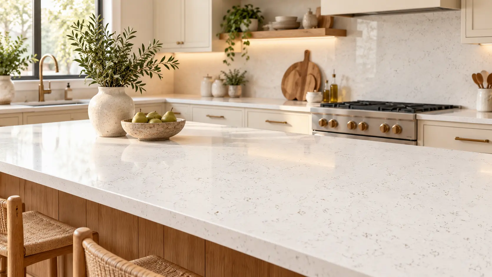
Warm neutral quartz countertops are showing up in more kitchen and bathroom conversations because homeowners want spaces that feel calm, current, and livable. Stark white still has its place, but many people are now looking for something softer: creamy whites, light taupes, greige movement, muted brown veining, soft gold detail, and organic color that feels less cold once it is installed.
That shift makes sense. The NKBA 2026 Kitchen Trends Report found that neutrals remain the most popular kitchen colors, while greens and blues are also highly favored by designers and industry professionals. That lines up with what many homeowners are already noticing in inspiration photos: warm neutrals are not replacing personality; they are becoming the base that lets wood tones, brass hardware, soft greens, natural light, and layered textures work together.
The tricky part is that “warm neutral” can mean several different things. One homeowner may picture creamy marble-look quartz with soft gold veining, while another may want a muted organic slab that leans green, taupe, beige, or weathered stone. If you are comparing warm neutral quartz countertops online, the goal is not to find the single “best” neutral. The goal is to understand undertone, movement, contrast, and how each slab will feel in your actual room.
What Makes a Quartz Countertop Feel Warm and Neutral?
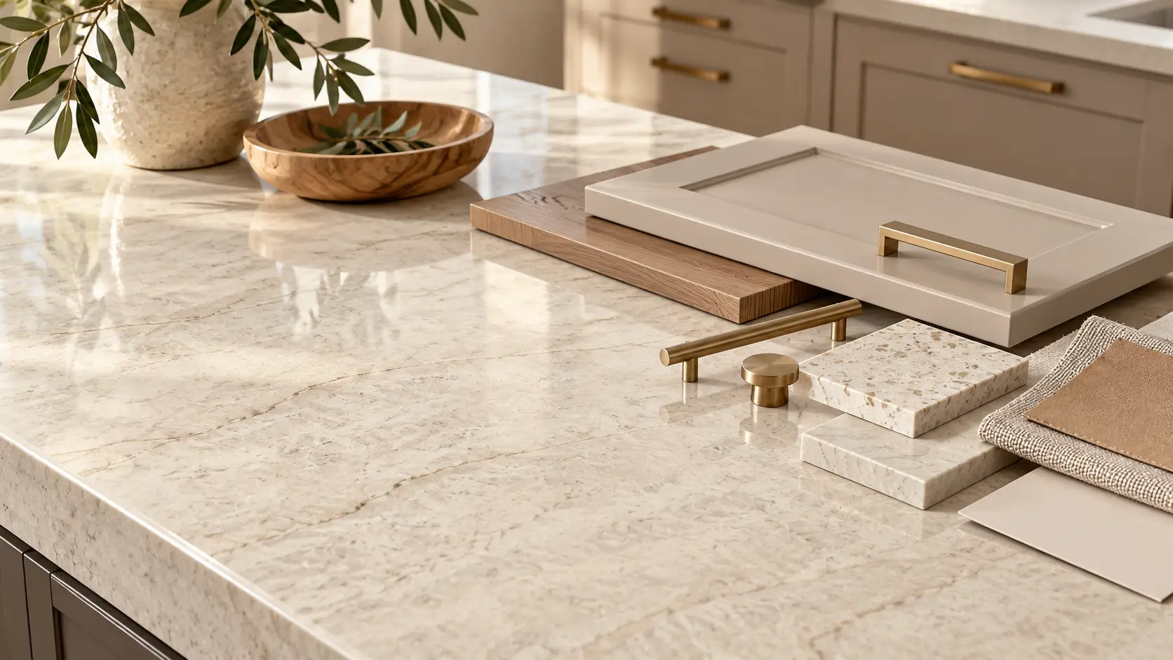
A warm neutral quartz countertop usually has an undertone that feels soft instead of icy. That warmth can come from cream in the background, beige or taupe movement, brown-grey veining, soft gold detail, or a muted organic color that pairs naturally with wood, painted cabinetry, and brushed metal finishes.
This is where many homeowners get stuck. A slab can look white at first glance but feel warm once you notice the veining. Another slab can look beige online but feel more grey in a showroom. Lighting, cabinet color, flooring, backsplash, and wall paint can all change how the slab reads once it is part of a finished space.
A good way to compare warm neutrals is to stop asking, “Is this white or beige?” and start asking, “What is the mood of this slab?” Some warm neutral quartz countertops feel clean and polished. Others feel earthy, organic, dramatic, quiet, creamy, or sunlit. That emotional read matters because countertops cover a large surface area and influence the whole room.
Why Warm Neutral Quartz Works So Well in Kitchens and Bathrooms
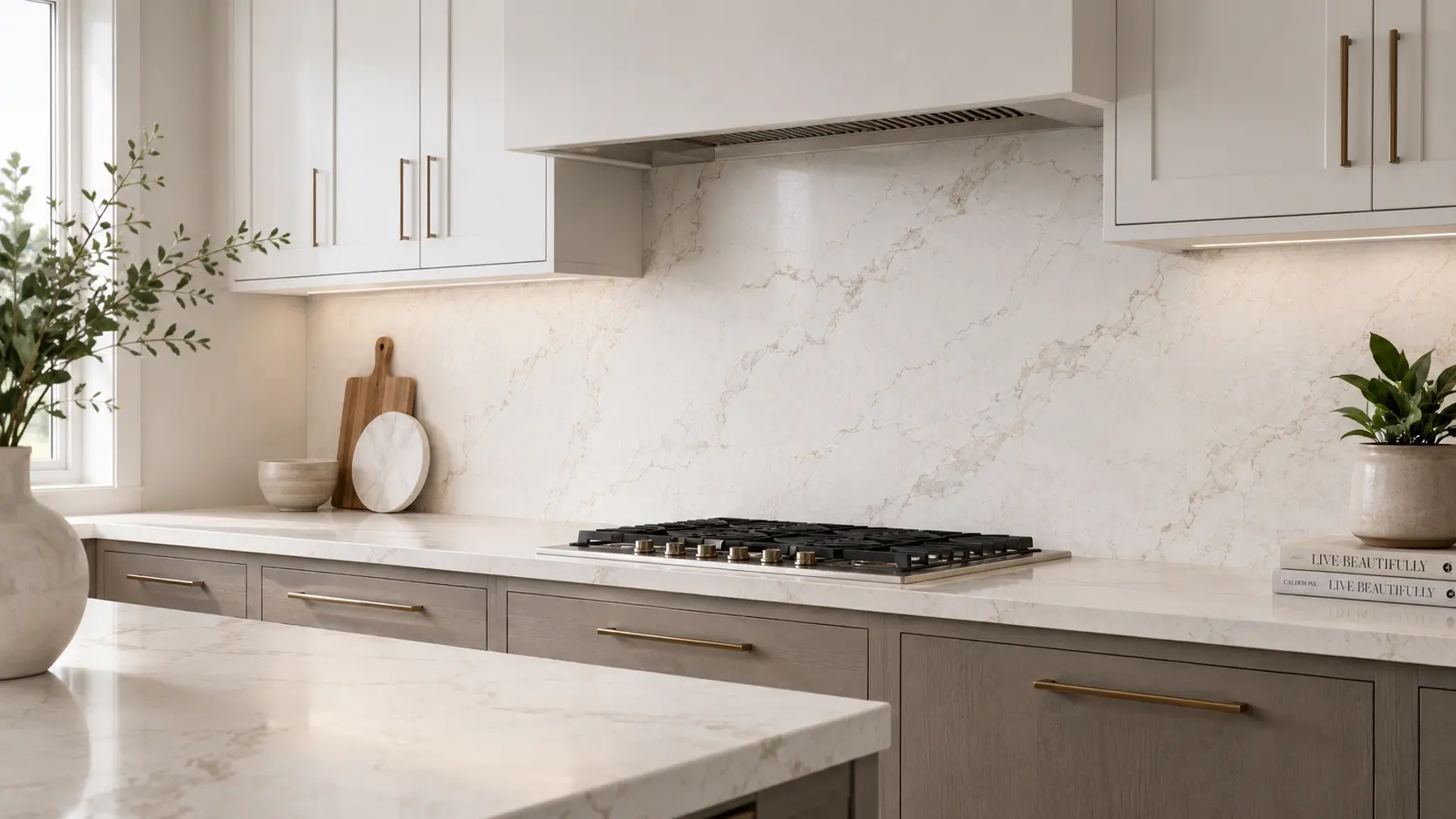
Warm neutral quartz countertops work because they give a room softness without making it feel dark or heavy. They are especially useful in kitchens where homeowners want a timeless foundation but do not want the space to feel flat, sterile, or overly grey.
In a kitchen, warm neutral quartz can bridge several finishes at once. It can soften bright white cabinets, connect with natural wood floors, warm up black fixtures, and make brass or champagne hardware feel intentional. It can also make a backsplash feel more finished when the same slab or a coordinating quartz surface is carried up the wall.
In a bathroom, warm neutrals can make the space feel more spa-like without forcing everything into plain white. Soft movement, creamy backgrounds, muted earth tones, and gentle veining can make a vanity, shower ledge, tub deck, or backsplash feel warmer and more designed.
The key is not choosing the trendiest slab. The key is choosing the warm neutral direction that fits the materials already in the room.
Six Warm Neutral Quartz Directions to Compare
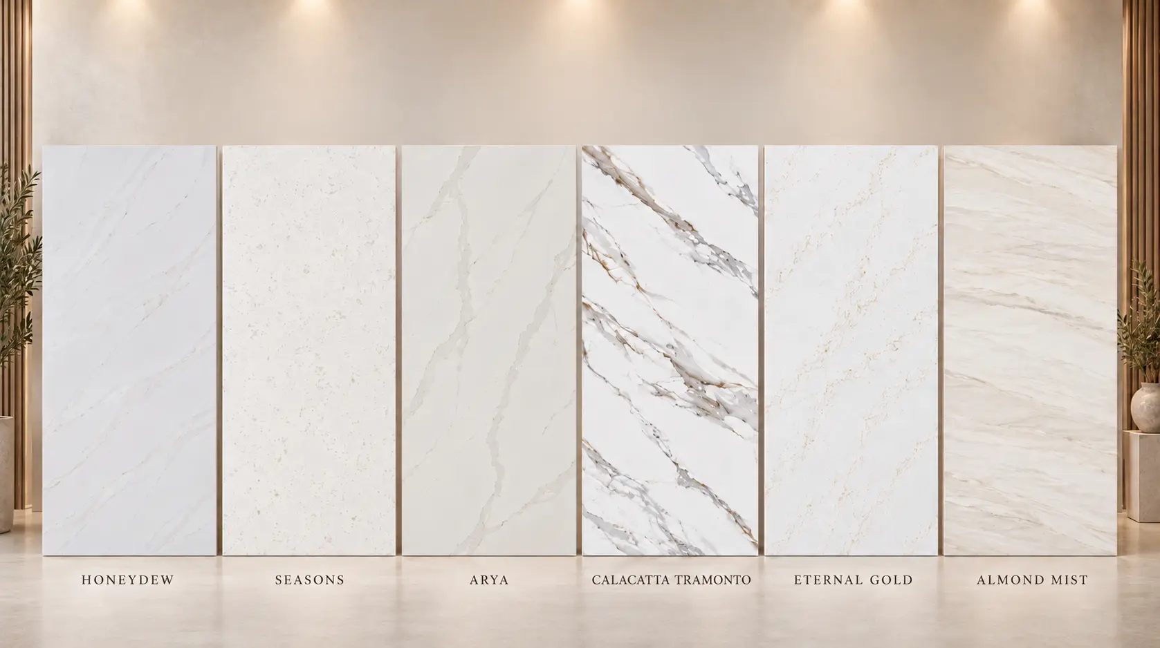
If you are drawn to warm neutral quartz countertops, these six Luxcore slabs are helpful reference points because each one solves a slightly different design problem. Use them as a comparison guide before you narrow your shortlist.
Honeydew: Soft Organic Warmth
Honeydew quartz is a strong option if you want a warm neutral look with an organic, nature-inspired feel. Luxcore describes Honeydew with a white base, flowing brown and grey veins, and a soft natural character that works for kitchens, bathrooms, floors, and backsplashes.
This type of slab is helpful when you want warmth but do not want the countertop to feel yellow, beige, or overly traditional. The brown and grey movement gives it more depth than a flat white quartz, while the lighter background helps it stay fresh. Honeydew can work well with light wood, creamy cabinets, muted green accents, and warm metal finishes.
Honeydew is worth seeing in person because its appeal depends on balance. Online, soft brown-grey movement can look more or less pronounced depending on the photo, screen brightness, and surrounding finishes. In a showroom setting, you can compare whether it feels calm enough for your space or whether you want something with stronger veining.
Seasons: Warm White With a Gentle Gold Glow
Seasons quartz fits the homeowner who wants a bright countertop but does not want the room to feel cold. Luxcore lists Seasons with a white background, gold vein color, polished finish, and a 137 x 79 super jumbo slab size.
This is the kind of warm neutral that works well when your design direction includes creamy whites, soft brass, champagne bronze, light oak, or warm painted cabinetry. It gives you the clean look of a white surface while the gold veining adds warmth and movement. That makes it a good direction for kitchens that need a little visual detail without becoming too busy.
Seasons is also useful if you are comparing marble-look quartz options. Some marble-look slabs lean cool with grey veining, while others lean warmer through gold or beige movement. If your cabinets, floors, or hardware already lean warm, a slab like Seasons may feel more connected to the rest of the room.
Arya: Refined Warmth With Stronger Contrast
Arya quartz is a better fit if you like warm neutrals but still want a little drama. Luxcore lists Arya with a white background, grey and gold vein color, a polished finish, and book match features, giving it more visual contrast than very subtle warm whites.
This is a good slab direction for homeowners who want the countertop to feel like a design feature, not just a background surface. The grey keeps it grounded, while the gold adds warmth. That mix can work especially well in kitchens with darker islands, brushed brass details, warm wood floors, or simple cabinetry that needs more movement.
The thing to watch with Arya is scale. A stronger vein pattern can look beautiful on a slab photo but feel different once it is cut for an island, perimeter countertop, vanity, or backsplash. If you are considering a more dramatic warm neutral, ask to see the full slab and think about where the most active movement will land.
Calacatta Tramonto: Soft Gold Movement on a Warm White Base
Calacatta Tramonto quartz is a warm white quartz direction for homeowners who love the marble-look style but want it to feel soft and inviting. Luxcore describes Calacatta Tramonto with a pure white background and gentle gold veining that creates a warm, tranquil feel.
This is a strong option for kitchens where the goal is elegant but not overly formal. The gold veining helps the slab pair naturally with warm lighting, creamy cabinet colors, wood flooring, and brass or bronze fixtures. It can also work well in bathrooms where you want a clean surface that still has warmth and movement.
If you are comparing Calacatta-style quartz slabs, pay close attention to the spacing and strength of the veining. Two slabs can both be “white with gold veining,” but one may feel quiet and the other may feel bold. Calacatta Tramonto belongs on the softer, warmer side of that comparison.
Eternal Gold: Bolder Warm White With Grey and Gold Movement
Eternal Gold quartz is a stronger warm neutral direction for homeowners who want a polished marble-look surface with more presence. Luxcore lists Eternal Gold with a white background, grey-gold veining, polished and leathered finish options, and a 137 x 79 super jumbo slab size.
This slab direction works well when you want the countertop or backsplash to help define the room. The gold brings warmth, while the grey gives the design a little structure. That combination can keep the space from feeling too yellow, too beige, or too plain.
Eternal Gold is especially worth comparing side by side with softer gold-veined slabs. If you are deciding between subtle and statement-making, look at how much movement you want on the island, how visible the countertop will be from nearby rooms, and whether the slab will continue up the wall as a backsplash.
Almond Mist: Soft, Layered, and Calm
Almond Mist quartz is a warm neutral option for homeowners who want something calmer than high-contrast veining. Luxcore describes Almond Mist with a soft warm light-grey background and flowing grey and muted brown veining, giving it a layered natural-stone look that pairs with light wood, creamy cabinetry, brushed metals, and soft neutral finishes.
This is the kind of slab that can make a room feel finished without demanding all the attention. It is especially useful if your cabinets, floors, or tile already have texture and you do not want the countertop competing with them. Almond Mist can also work well for bathrooms, laundry rooms, secondary kitchens, or full-height backsplashes where a softer pattern feels more restful.
For homeowners who like organic design but do not want green, gold, or bold marble movement, Almond Mist is a practical direction to explore. It gives you warmth through layering and muted veining rather than obvious color.
How to Choose the Right Warm Neutral for Your Space
Start with your fixed finishes. If your flooring is already installed, bring a sample or a clear photo of it. If your cabinets are selected, bring the door sample. If you already know your hardware finish, bring that too, because warm neutrals can shift when placed next to black, chrome, brass, bronze, or nickel.
Next, compare undertones instead of only comparing slab names. A warm white with gold veining will behave differently than a light grey slab with muted brown movement. A creamy surface may soften a kitchen, while a grey-gold pattern may give the room more contrast and structure.
Then, think about movement. If your cabinets are simple and your backsplash will be quiet, a stronger slab like Arya or Eternal Gold may bring the right amount of interest. If your cabinets, floors, lighting, or backsplash already have texture, a calmer option like Almond Mist or Honeydew may feel more balanced.
Finally, decide whether the countertop is meant to be the feature or the foundation. Feature slabs draw the eye and become part of the room’s identity. Foundation slabs support the whole design without taking over, which can be ideal for homeowners who want a timeless warm neutral look.
Why Online Photos Are Only the Starting Point
Online slab photos are helpful for building a shortlist, but they are not the final decision. Screens can make a slab look warmer, cooler, brighter, or flatter than it really is, especially with subtle neutrals. A warm grey may look beige on one screen and cool grey on another.
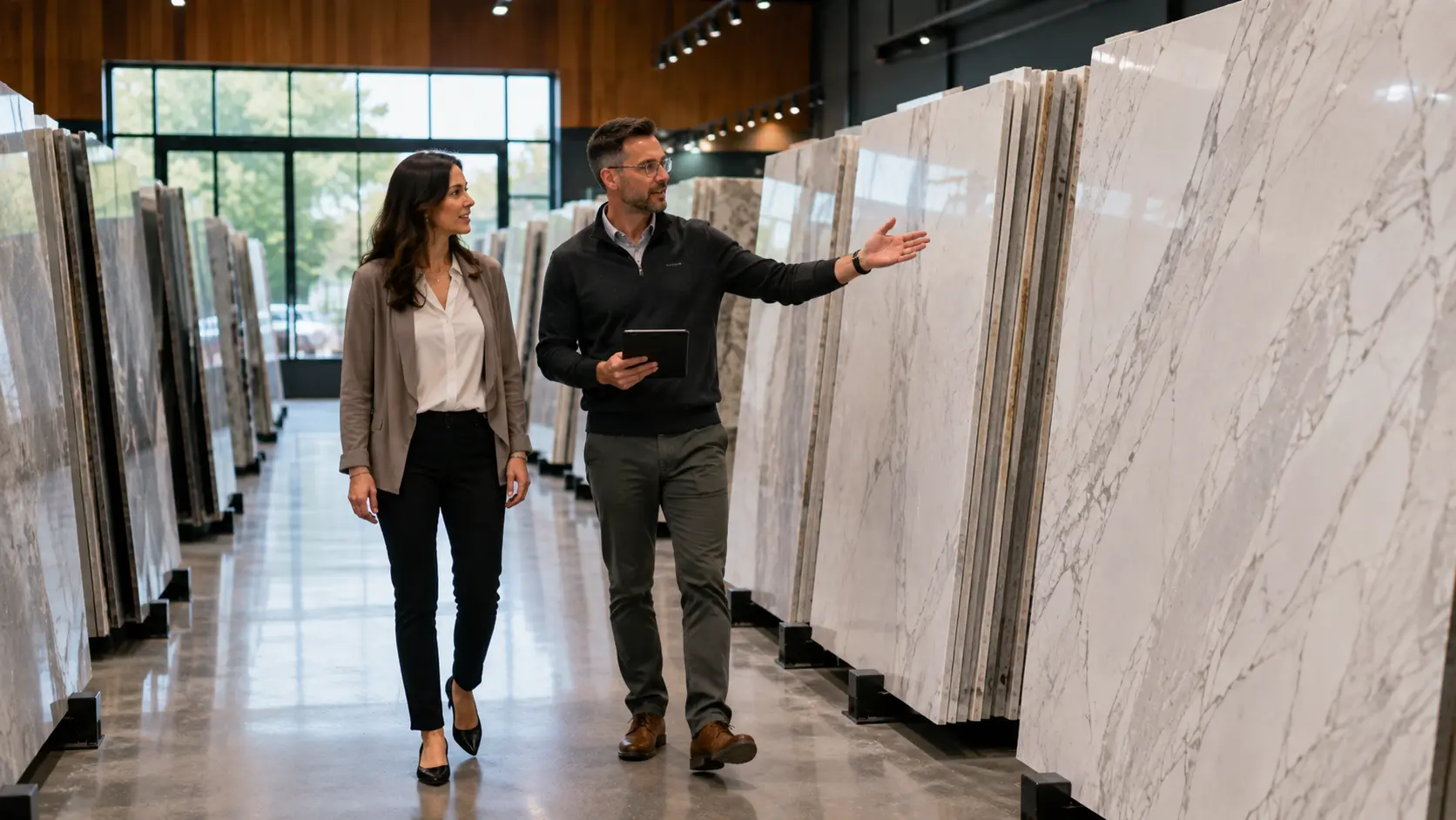
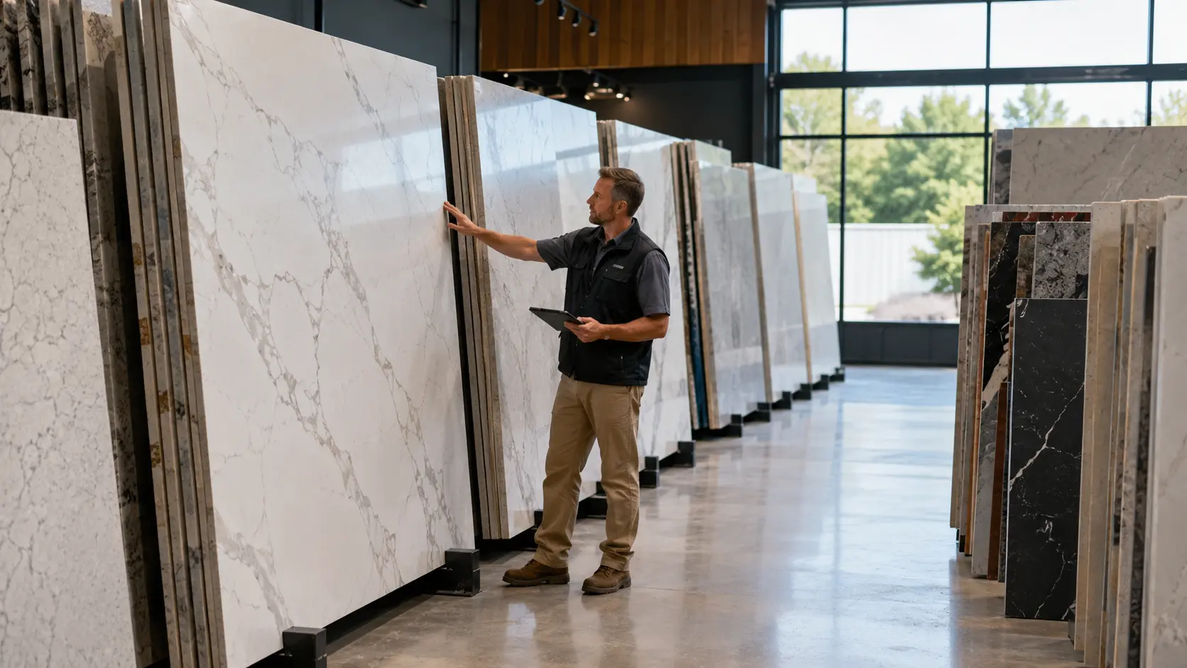
This is why it helps to compare slabs in person before you commit. You can see the background tone, the vein color, the scale of the movement, and how polished surfaces reflect light. You can also place similar slabs next to each other, which is often the fastest way to understand what you actually prefer.
If you are still learning how to compare veining, movement, background, and finish, read How to Read a Quartz Slab: Veining, Background, Movement, and Finish. That guide can help you look at a slab with more confidence before you visit the showroom.
What to Bring When You Compare Warm Neutral Quartz
Bring anything that helps show the real color story of your space. Cabinet samples, flooring samples, paint swatches, tile samples, hardware finishes, and inspiration photos are all useful. Even quick phone photos of your kitchen or bathroom can help the Luxcore team understand the room’s natural light and overall direction.
You do not need to have every design decision finalized before looking at slabs. In many remodels, the countertop helps guide the wall color, hardware, cabinet tone, tile, and overall finish palette. The important thing is to compare materials together instead of choosing each piece in isolation.
It also helps to come in with a short list. For this warm neutral direction, you might compare Honeydew, Seasons, Arya, Calacatta Tramonto, Eternal Gold, and Almond Mist in one visit. Seeing them side by side can quickly show whether you prefer soft organic movement, warm white marble-look veining, stronger gold detail, or a calmer layered neutral.
How to Compare Warm Neutral Quartz Before You Decide
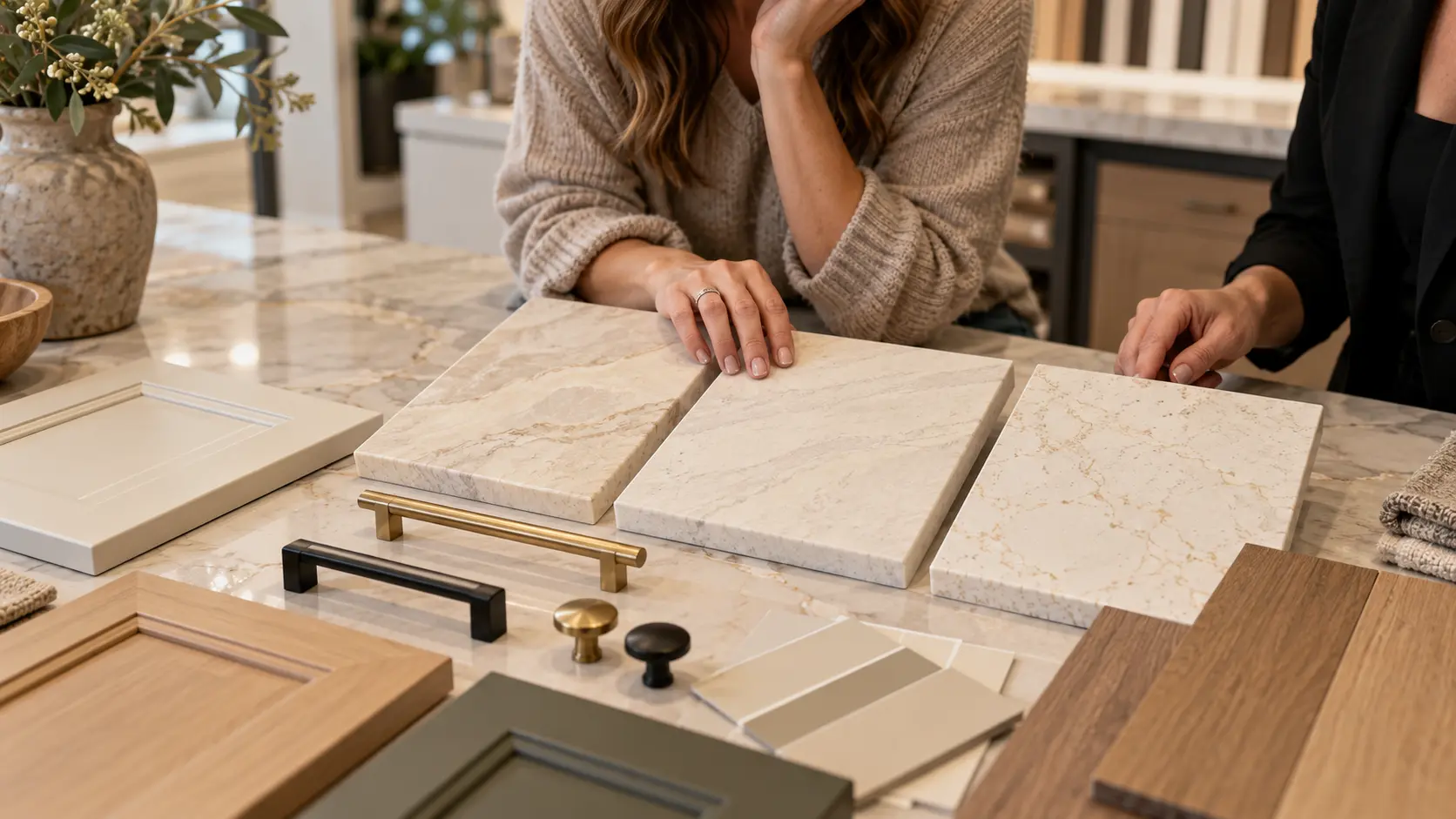
If you are drawn to warm neutral quartz countertops, start by saving two or three slabs that match the feeling you want in the room. Do not worry about making the final decision from a screen. Use online photos to narrow the direction, then plan to compare the slabs in person before you commit.
Visit the Pacific by Luxcore Surfaces collection to review warm, neutral, marble-look, and organic slab options.
Before you visit, bring cabinet, flooring, hardware, tile, or paint samples if you have them. If you are still early in the process, bring inspiration photos instead. The goal is simple: compare warm neutral slabs side by side, confirm current availability, and choose the surface that feels right in your actual home.
FAQs About Warm Neutral Quartz Countertops
What are warm neutral quartz countertops?
Warm neutral quartz countertops are quartz surfaces with soft, livable undertones such as cream, beige, taupe, greige, muted brown, warm grey, soft green, or gold movement. They are still neutral, but they feel less stark than bright white or cool grey countertops.
This makes them useful in kitchens and bathrooms where homeowners want a calm, timeless foundation. Warm neutrals can pair with white cabinets, wood cabinets, painted cabinets, natural flooring, brushed metal finishes, and soft organic design choices.
Are warm neutral countertops better than white countertops?
Warm neutral countertops are not automatically better than white countertops, but they can be easier to live with if you want a softer room. Bright white quartz can look clean and modern, but in some spaces it may feel cold once paired with cool lighting, grey flooring, or high-contrast finishes.
A warm neutral quartz surface can still feel light and fresh while adding more depth. If you like white kitchens but want them to feel warmer, look at warm white slabs with cream, gold, beige, taupe, or muted grey-brown movement.
Which warm neutral quartz works best with wood cabinets?
Wood cabinets usually pair well with warm neutrals because both materials have organic warmth. Slabs with soft gold, beige, brown-grey, taupe, or light warm-grey movement can connect naturally with oak, walnut, maple, alder, and other wood tones.
The best choice depends on the wood species and stain color. Light oak may pair beautifully with creamy or soft grey-brown quartz, while deeper walnut may need a brighter warm white or gold-veined slab to keep the room from feeling too heavy.
Can warm neutral quartz work with green, blue, or painted cabinets?
Yes, warm neutral quartz can work beautifully with green, blue, mushroom, taupe, cream, and other painted cabinet colors. The key is choosing a slab with undertones that support the cabinet color instead of fighting it.
For example, a soft green cabinet may pair better with organic brown-grey movement or creamy warmth than with a stark cool white slab. A deep blue cabinet may need a lighter warm white or gold-veined quartz to keep the room balanced.
How do I know if a quartz slab will look different in my home?
A quartz slab can look different at home because lighting, surrounding colors, cabinet finish, floor color, and wall paint all affect how the undertone reads. A slab that looks warm in a showroom may look cooler next to grey floors, and a slab that looks subtle online may show more movement when viewed at full scale.
That is why it helps to bring samples and photos when you compare slabs. Seeing your materials next to the quartz gives you a more realistic sense of whether the surface will feel creamy, golden, grey, taupe, organic, or bright once installed.